

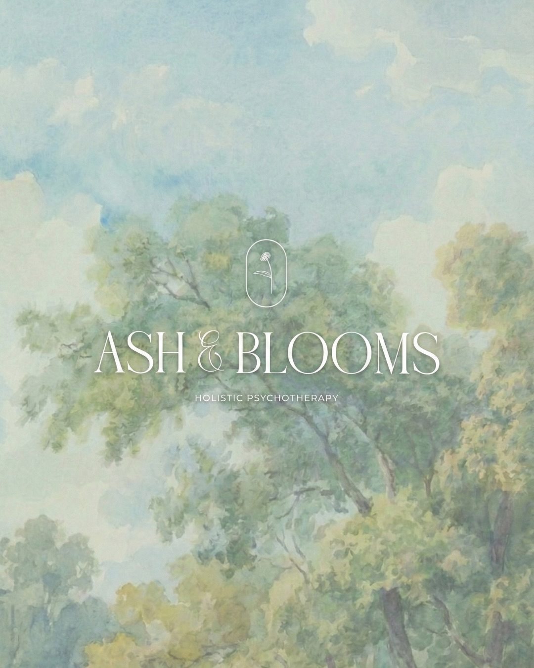
Ash & Blooms Holistic Psychotherapy
What Grows After
Brand identity & website Therapy & counselling
Ash & Blooms is a boutique holistic psychotherapy practice for women and LGBTQ+ adults, with offices in Beverly Hills, Santa Monica and Pasadena and online sessions across California. Its therapists specialise in trauma and work through the body as much as the mind, and the practice wanted a brand that felt the way good therapy does: calm, unhurried and quietly hopeful.
Services
- Brand Identity
- Brand Guidelines
- Website Design
- Art Direction
- Print & Stationery
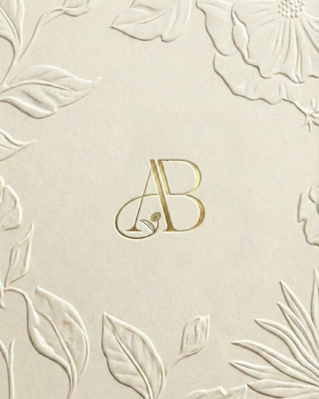
The AB monogram

Journals & keepsakes
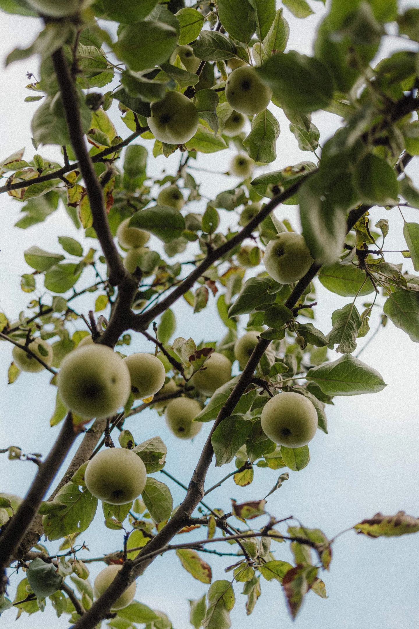
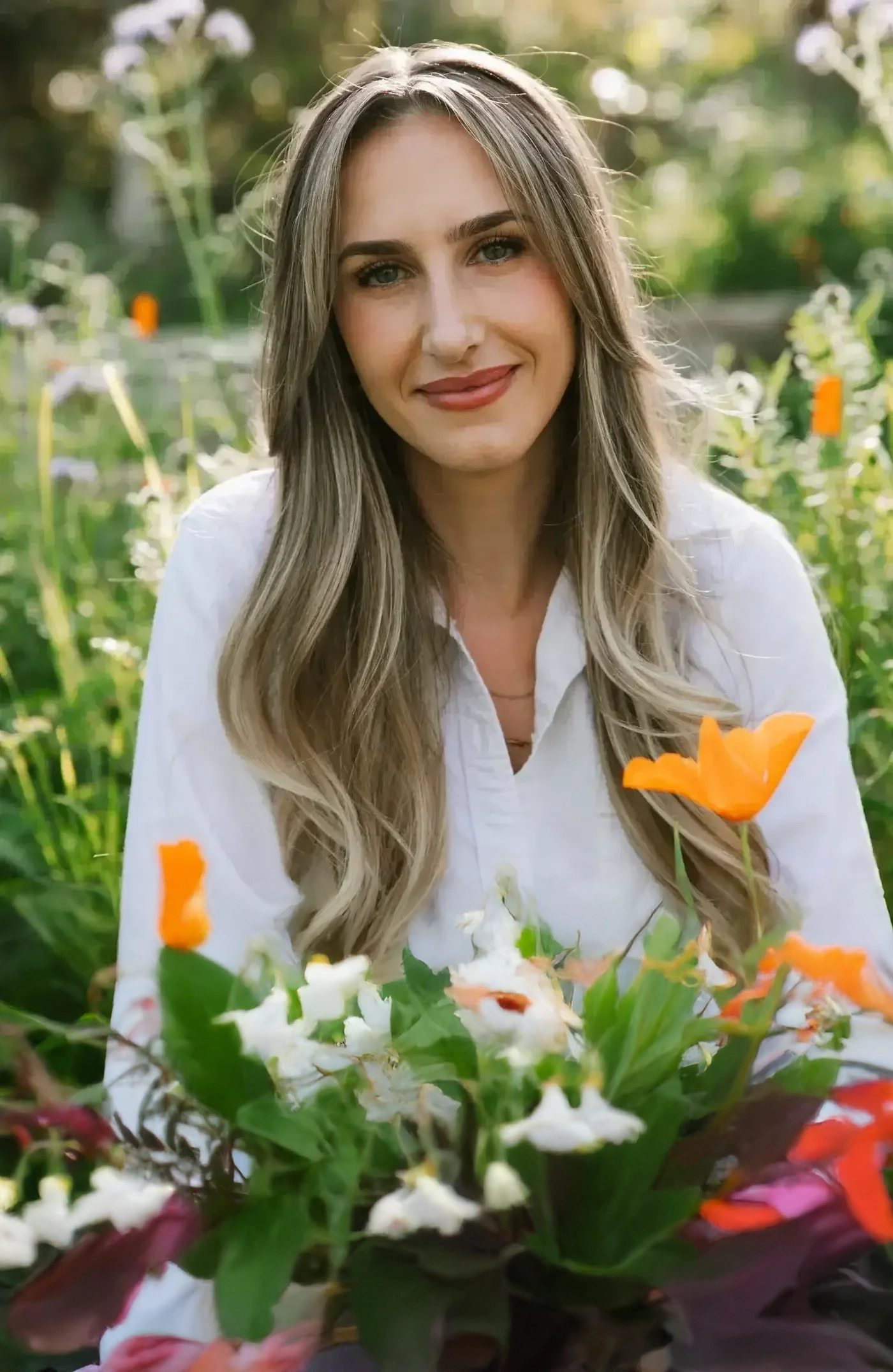
At the heart of the creative direction was What Grows After. The name holds both halves of healing, what has burned away and what comes up through it, and we let that set the tone: nothing clinical and nothing hurried, a world of orchards, gardens and slow natural light where growth is allowed to take its time.
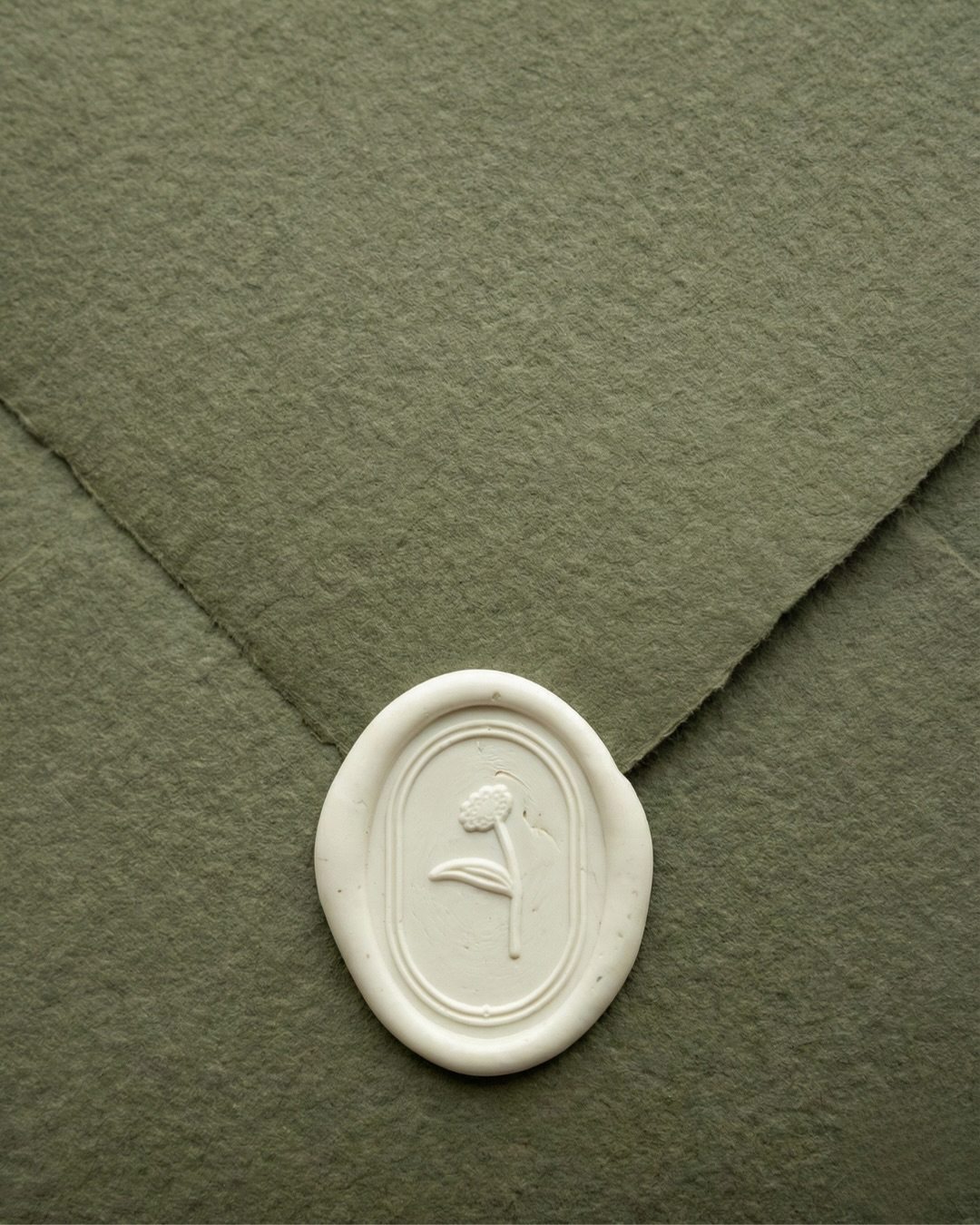
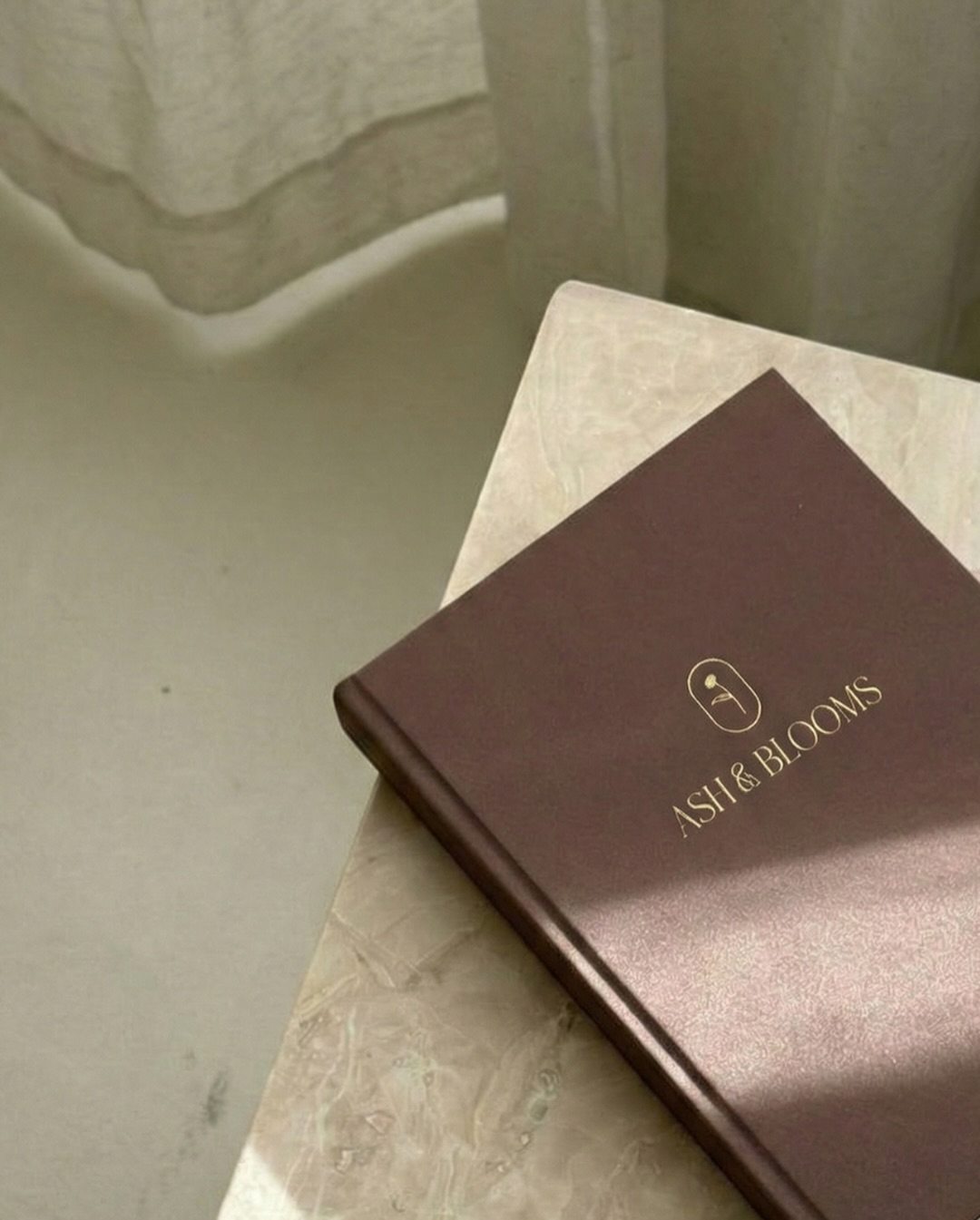
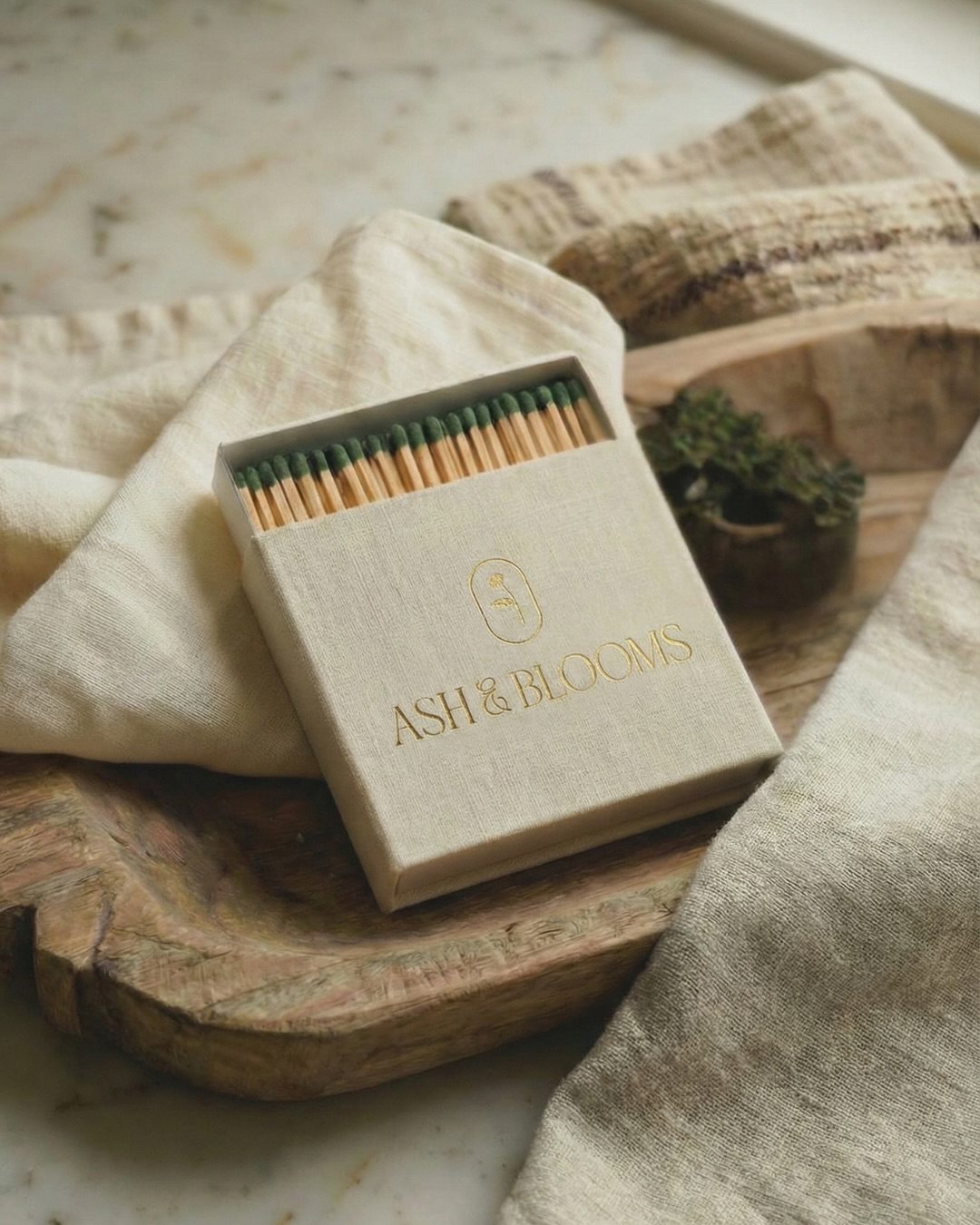
The palette is taken from that landscape, in olive and sage, warm ivory and a deep plum, with gold kept for the smallest details. A single stem grows through the AB monogram, and a flower held in an oval becomes the practice’s seal: pressed into wax, foiled onto journals and printed on matchboxes. The website brings the same calm to a great deal of information, guiding visitors from what they are carrying to the approach and therapist that fit, and on to a first consultation. The result is a practice that feels safe before a word is spoken.
-
Your brand, next
ROOM TO GROW
Brand identity, websites and the details in between, for founders who want every touchpoint to feel like them.