

Xtended Hair Co. Hair Extensions
Through the Arch
Brand identity & website Beauty & hair
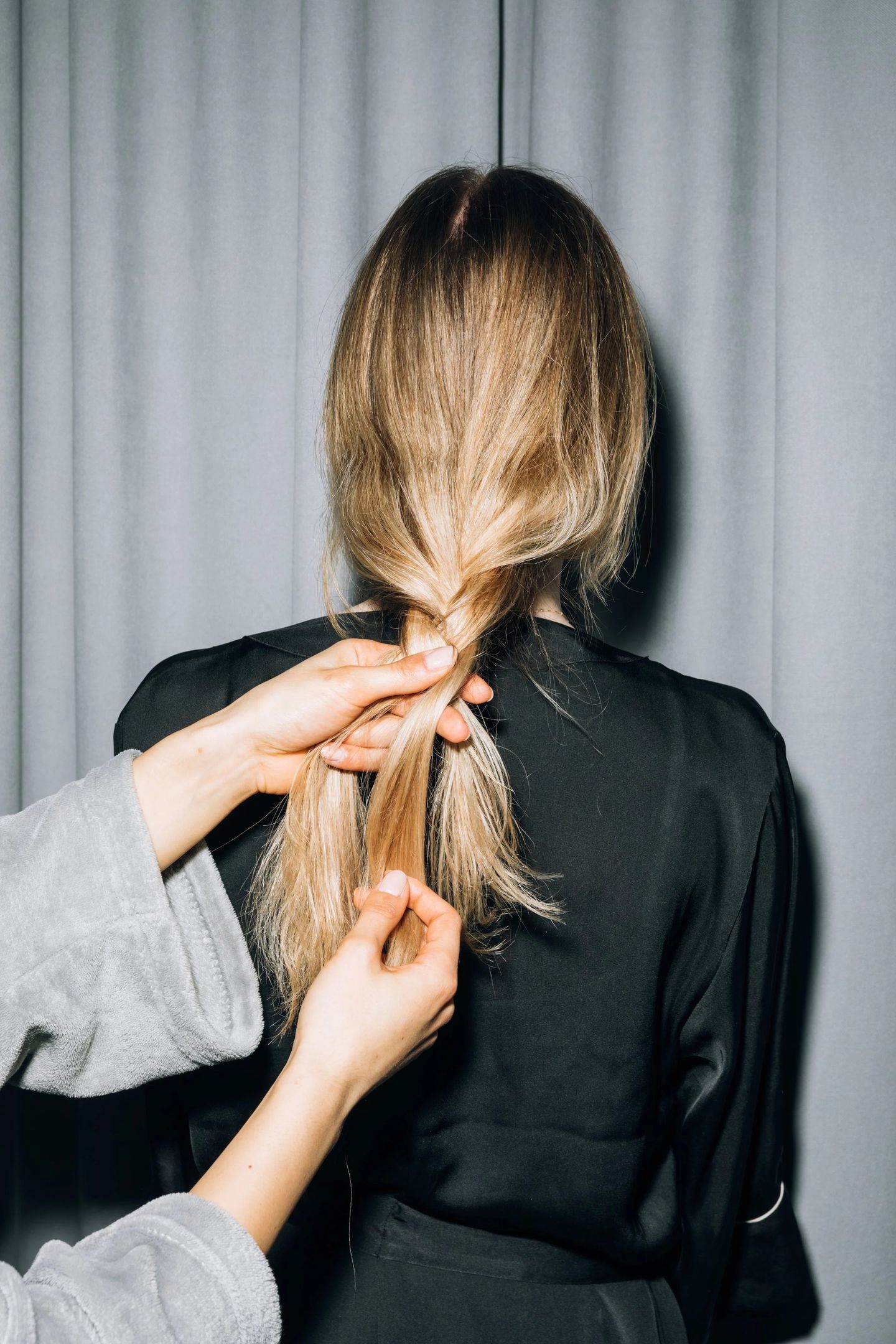
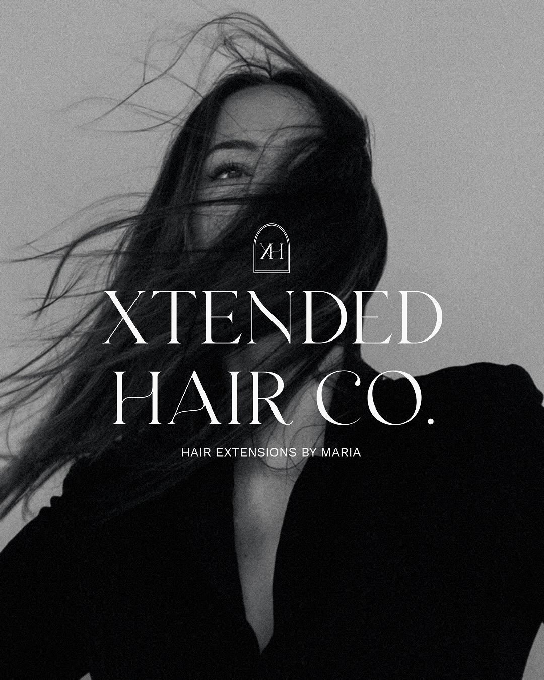
Xtended Hair Co. is a hair extension studio in Mississauga, Ontario, offering premium extensions, salon colour and fitting services, and online training for stylists learning the craft. Its founder wanted a brand that could speak to all three audiences at once, with the polish of a beauty house and the warmth of a chair you look forward to sitting in.
Services
- Brand Identity
- Brand Guidelines
- Website Design
- Art Direction
- Signage & Print
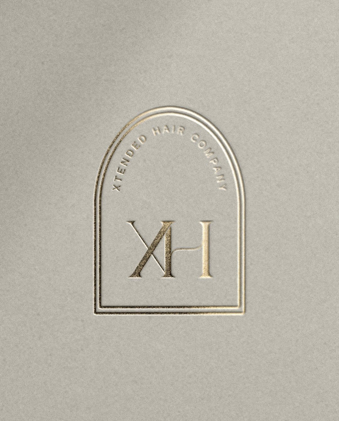
The XH monogram & the arch
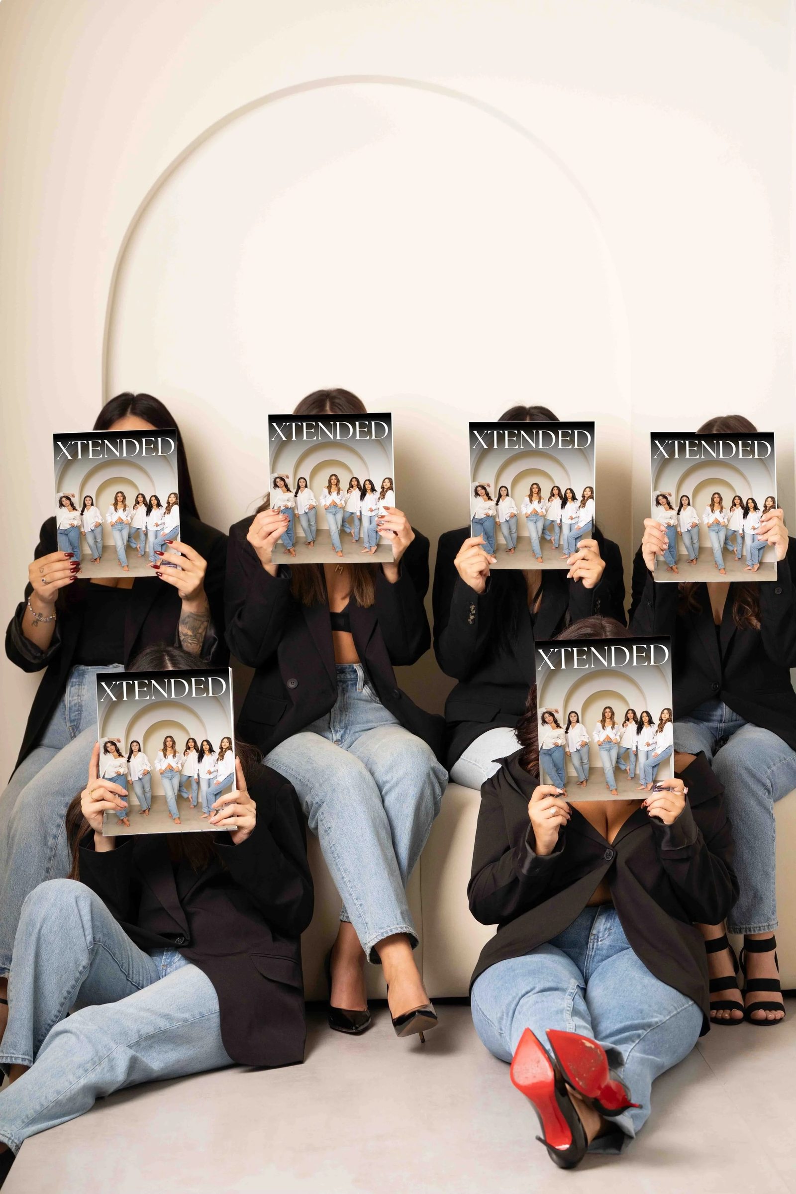
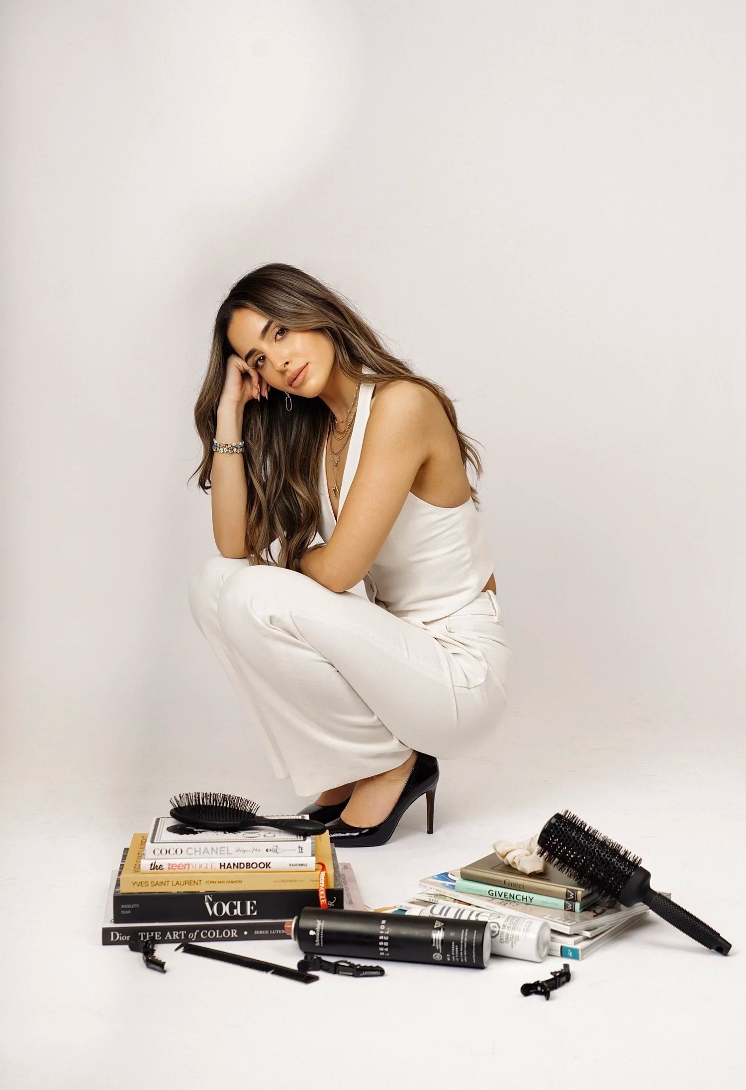
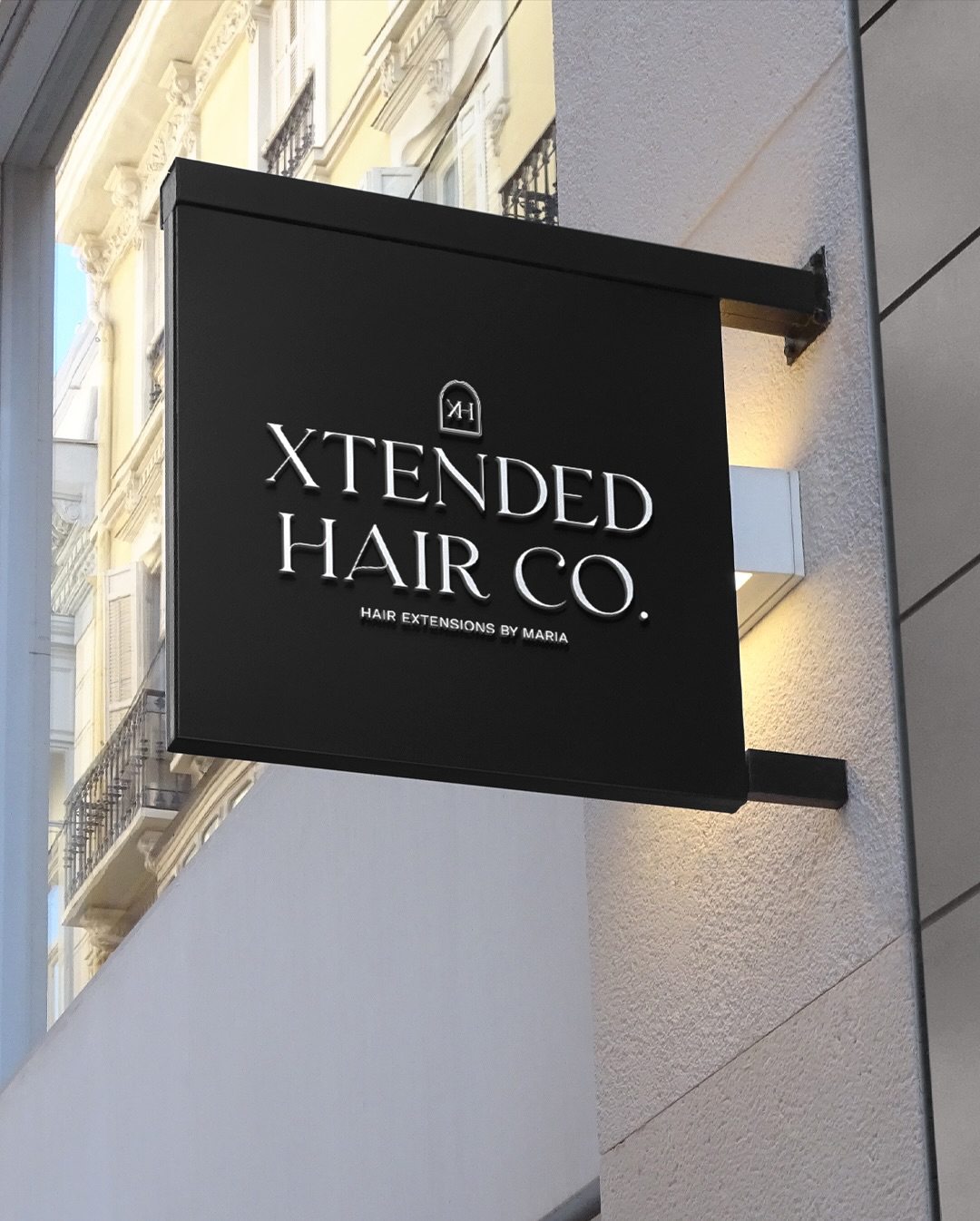
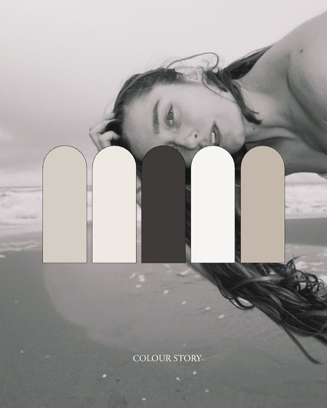
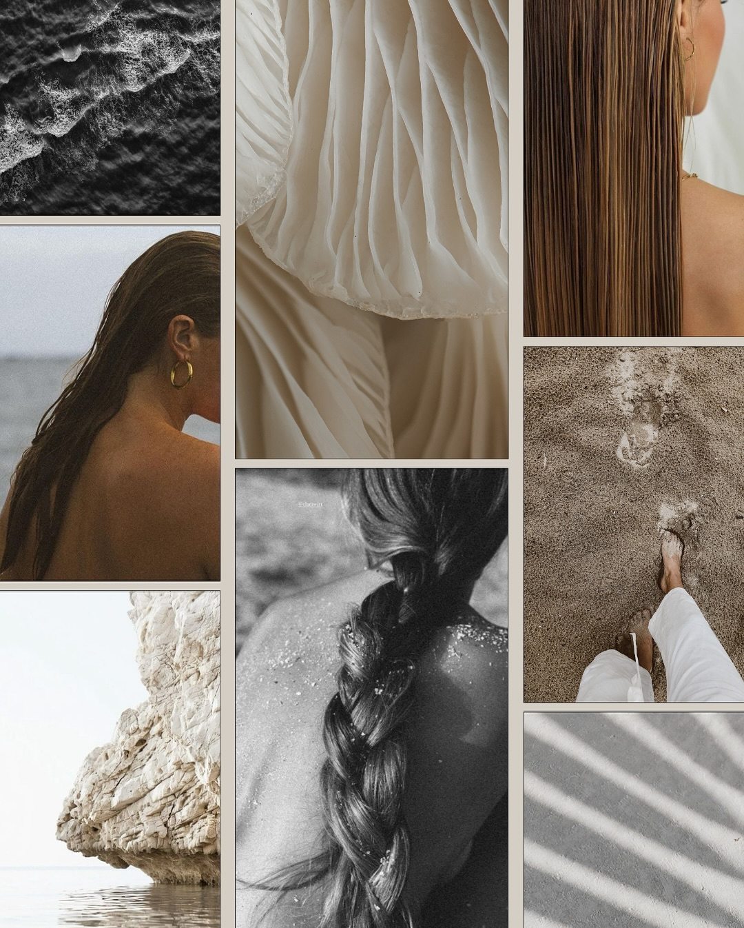
Colour story & mood board
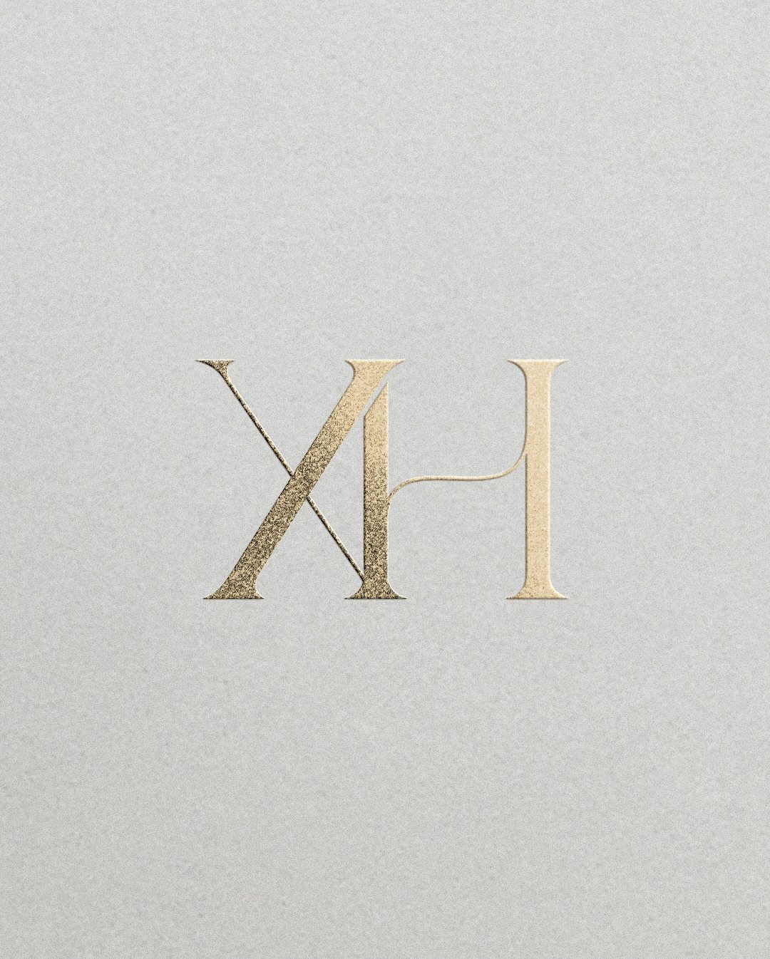
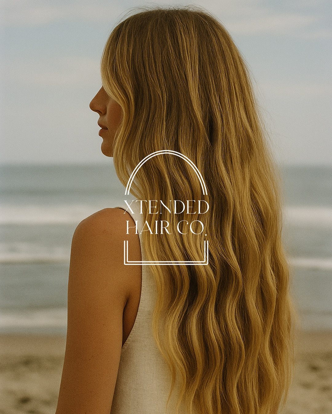
At the heart of the creative direction was the arch. An arch is a doorway, and a salon is one too: you walk in one way and leave another. We drew the X and the H as a single interlocking monogram and set it beneath a fine arched frame, a shape that returns in the colour story, the signage and the site.
The palette stays close to natural hair and skin, in warm sand, stone and soft white, grounded in charcoal and finished in brushed gold. The monogram is foiled onto textured card, the full wordmark hangs on a black sign, and black-and-white portraiture gives the brand its editorial edge. The website brings the shop, the salon and the training together, with shade matching to help clients choose a colour before they book. The result is a brand that looks as good as its clients feel on the way out.
-
Your brand, next
READY FOR YOUR REVEAL
Brand identity, websites and the details in between, for founders who want every touchpoint to feel polished.